Cards
Bootstrap-Cards bieten einen flexiblen und erweiterbaren Content-Container mit mehreren Varianten und Optionen.
Es enthält Optionen für Kopf- und Fußzeilen, eine Vielzahl von Inhalten, kontextbezogene Hintergrundfarben und leistungsstarke Anzeigeoptionen.
Card Hover Effect
Some quick example text to build on the card title and make up the bulk of the card's content.
Card title
Card subtitle
Some quick example text to build on the card title and make up the bulk of the card's content.
With supporting text below as a natural lead-in to additional content.

Some quick example text to build on the card title and make up the bulk of the card's content.

Card title
Some quick example text to build on the card title and make up the bulk of the card's content.
Hier einige Beispiele, die ich mit dem Inhaltselement "BS Card" umgesetzt habe.
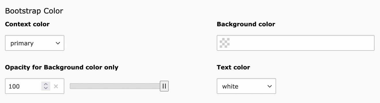
Unter "Content" kann der Header, Bodytext, Listengruppen, Bodytext und der Footer eingegeben werden. Das Bild wird unter "Medien" geladen und die Einstellungen können unter "Erscheinungsbild" angepasst werden.


Special title treatment
With supporting text below as a natural lead-in to additional content.
Special title treatment
With supporting text below as a natural lead-in to additional content.
Primary card title
Some quick example text to build on the card title and make up the bulk of the card's content.
This is some text within a card body.
Success card title
Some quick example text to build on the card title and make up the bulk of the card's content.
This is some text within a card block.

Horizontal
This is a wider card with supporting text below as a natural lead-in to additional content. This content is a little bit longer.
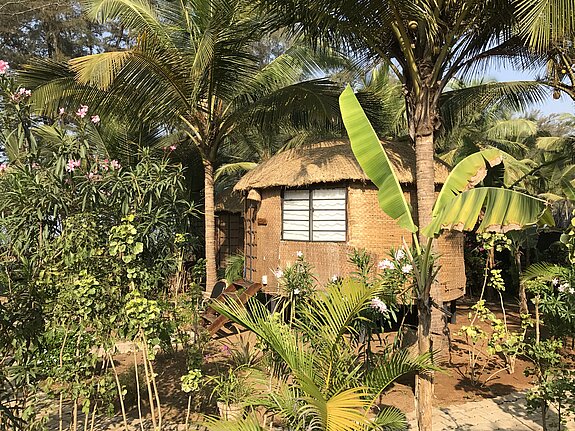
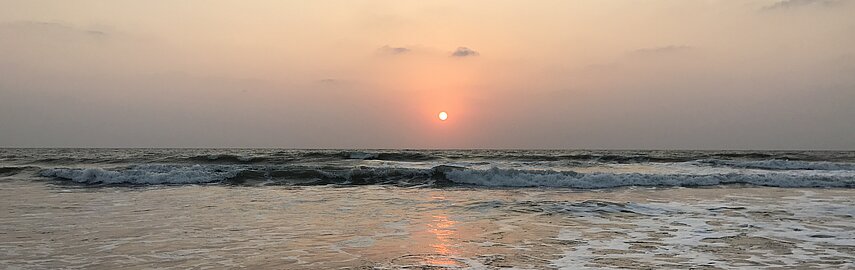
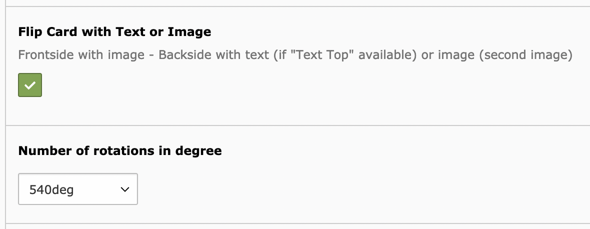
Flip Card

Text Top
Es wird min. ein Image für die Front erwartet.
Ein zweites Image für die Rückseite ist optional.
"Extra Class - img-tag" wie hier "rounded-circle" wird berücksichtigt.


Profile Card
Das zweite ist das kleine, kreisrunde Card Image. Das Image kann in der Größe angepasst werden.


Infos: